Garden Inspired cardmaking with the Love, Preserved 3D Embossing folder and the Mini Delight: Gardener's Corner
Key Takeaways
Ink blended backgrounds add instant depth. This is an easy technique for cardmaking beginners to try and master.
Embossing folders elevate simple panels. Running your blended background through with the Love, Preserved 3D Embossing Folder adds rich, herbal texture with almost no effort — a great way to add dimension to your cardmaking without complicated tools.
Die cut pieces look more realistic with ink blending. Even when cutting shapes from plain white cardstock, adding a touch of ink (like greens and purples on the lavender sprig) gives your elements natural shading and helps them pop on the card.
Anchoring your focal point creates balance. Using a glittery label shape behind your die cut cluster helps separate similar colors and gives your design a clear “home base.” This is a simple design principle that makes layered cardmaking feel more polished.
Hello, crafty friends! Lea here today with another edition of Light & Airy with Lea. There’s something so refreshing about sitting down for a bit of peaceful cardmaking, especially when the project feels soft, serene, and full of gentle detail.
Today’s cardmaking project is exactly that — a pastel, garden‑inspired design featuring the Mini Delight: Gardener’s Corner Stamp and Die Set paired with the beautifully textured Love, Preserved 3D Embossing Folder. If you love cardmaking that leans botanical, delicate, and thoughtfully layered, this tutorial will be right up your alley.

Why I Love the Mini Delight Series for Cardmaking
Before we dive into the card itself, I want to highlight why the Mini Delight subscription is such a gem for the cardmaking community. These sets are perfect for crafters who want high‑quality designs without committing to larger, more expensive bundles. Each month, subscribers receive a new coordinating stamp and die set at an affordable price, and the following month it becomes available at regular retail cost.
What I love most is how versatile these smaller sets are for cardmaking. They’re ideal for:
Quick cardmaking sessions
Layered focal points
Accent clusters
Tags and mini projects
Trying new styles without a big investment
Because the designs are thoughtfully curated, they mix beautifully with your existing cardmaking stash. Today’s project is a perfect example of how a small set can shine when paired with texture, color, and a few well‑chosen supporting elements.

Creating the Soft Pastel Background
The background of this card is one of my favorite parts, because it sets the tone for the entire cardmaking design. I started with Love, Preserved 3D Embossing Folder, which already has a beautiful pastel lavender‑blue undertone. To enhance that softness and give the panel more depth, I blended a light ombré gradient using Glacier Iris and Dreamy Periwinkle inks.
Ink blending is such a foundational technique in cardmaking, and this project is a great example of how gentle blending can elevate a simple background. I focused the deeper tones toward the edges and allowed the center to stay lighter, creating a natural spotlight effect that helps the focal elements stand out later.
Once the gradient felt complete, I ran the panel through my diecutting machine using the Love, Preserved 3D Embossing Folder. This folder adds the most gorgeous herbal texture — leafy, organic, and full of movement. The ink blending catches on the raised areas in such a pretty way, giving the background instant dimension without overwhelming the design.
If you’ve never tried ink blending before embossing in your cardmaking, give it a go! The results are so smooth and dreamy.

Diecutting and Coloring the Gardener’s Corner Elements
Next, it was time to bring the Mini Delight: Gardener’s Corner pieces to life. I diecut all the elements from a mix of colored cardstock and white cardstock, knowing I wanted to add ink blending for depth and variation.
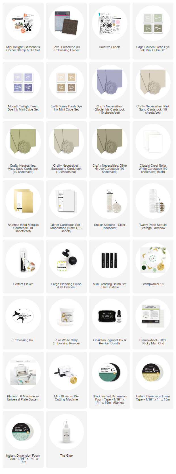
Cardstock colors used: Pink Sand, Glacier Iris, Misty Sage, Sagestone, Olive Grove, White and Brushed Gold.
This is where the cardmaking magic really starts to happen — each piece becomes more dimensional with just a touch of ink on the edges.
A Helpful Cardmaking Tip for the Lavender Sprig
One of my favorite details is the lavender sprig. It’s a single die, which makes it incredibly easy to customize. I cut it from white cardstock, then ink blended the stem in Olive Grove green and the buds in a mix of Moonlit Twilight purples. This gives it a more natural, hand‑painted look and helps it stand out among the other greenery.
Little touches like this make a big difference in cardmaking, especially when you’re working with smaller die‑cut elements.

Stamping and Heat Embossing the Sentiment
Before assembling anything, I stamped and heat embossed the sentiment directly onto the lower right corner of the background panel. The Stampwheel made this process so easy — especially since I wanted a multi‑tone sentiment.
I started by stamping the scripted “Hugs” and heat‑embossing it in Pure White embossing powder. Once that was set, I added the secondary sentiment in Obsidian ink directly below it. The crisp black ink paired with the soft white embossing creates a lovely contrast that feels intentional and balanced.
Sentiment placement is such an important part of cardmaking, and stamping it early ensures that none of the dimensional elements get in the way later.

Adding an Anchor Piece for the Focal Cluster
As I began laying out the diecut pieces, I realized that many of my colors were very similar — soft purples, greens, and neutrals. While beautiful, they blended into the background a little too much. I needed something to help the focal cluster stand out.
Enter the Creative Labels Die Set.
I cut the circle‑shaped label from Moonstone glitter cardstock, and it instantly became the perfect anchor point. The subtle sparkle adds interest without overpowering the delicate garden elements, and the cool tone complements the Glacier Iris background beautifully.
This is one of my favorite design tricks in cardmaking: When your focal point needs separation, add a grounding shape in a contrasting texture.
Check Out The Garden Inspired Cardmaking Tutorial Here!

With all the pieces ready, it was time to assemble. I arranged the greenery and florals inside the little crate, letting some pieces spill out naturally to create movement. A few elements were adhered flat, while others were popped up with Instant Dimension Foam Tape for added depth.
The combination of flat and raised pieces gives the arrangement a lush, layered feel — almost like a tiny bouquet. This kind of dimensional layering is one of the most satisfying parts of cardmaking, and it brings so much life to the finished project.
Once everything was in place, I added a few Clear Iridescent Stellar Sequins to finish the card. They catch the light beautifully and echo the shimmer of the Moonstone glitter cardstock without distracting from the soft, botanical theme.

This project is such a lovely reminder that cardmaking doesn’t have to be complicated to be beautiful. With a thoughtfully blended background, a few well-chosen die cut elements, and a touch of texture, you can build a card that feels polished, dimensional, and full of heart.
The Mini Delight: Gardener’s Corner truly shines here — and it’s a perfect example of why I adore the Mini Delight subscription. These small sets pack so much creative potential, and they’re ideal for cardmaking on a budget.
I hope this card inspires you to pull out your Mini Delight sets, experiment with ink‑blended backgrounds, or try pairing small images with bold textures. There are so many possibilities waiting to be explored in your own cardmaking journey.
If you recreate this design or put your own spin on it, I’d love to see what you make. Happy cardmaking, friends — may your next project feel as peaceful and joyful as a walk through a pastel garden.
Supply List